 The
style of this Scott Tissue ad is rather striking and forthright when it first
meets the eye. One issue that always comes up when dealing with Bolshevism (and
just communism in general) is color. Red, black, and white, the colors of
communism and the colors used for the symbol of the Bolshevik Revolution. The text, background, and main figure are in all black and white, while the word "Bolsheviks" is emboldened with the color red to give it extra emphasis and a foreboding impression. The outline around the short article is also colored in a more subdued red hue, as if to remind the reader whilst they are reading the article of the ominous nature of Bolshevism.
The
style of this Scott Tissue ad is rather striking and forthright when it first
meets the eye. One issue that always comes up when dealing with Bolshevism (and
just communism in general) is color. Red, black, and white, the colors of
communism and the colors used for the symbol of the Bolshevik Revolution. The text, background, and main figure are in all black and white, while the word "Bolsheviks" is emboldened with the color red to give it extra emphasis and a foreboding impression. The outline around the short article is also colored in a more subdued red hue, as if to remind the reader whilst they are reading the article of the ominous nature of Bolshevism.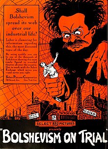

The use of the black and white for the main figure in the ad also plays a part in the style of the image, as well as the expression and posture the photographer has chosen to use for the figure. It gives the viewer a sense that the figure is very sinister, bolstering Scott Tissue's appeal to pathos in the form of playing on the fear of Americans during the Red Scare.
One can also see that there are commonalities between most Anti-Bolshevik propaganda and illustrated articles and the Scott ad. There seems to always be, of course, a theme of the red, black, and white. Also, there is always one, large, menacing figure in the center of the piece, as can be seen in the two other posters to the left and right.
I see that the Scott Tissue ad and many others that are anti-communist are usually black, red, and white. Do you think they were made these colors to immediately identify them as anti-communist? I just find it really strange that people who disliked Communism would choose to display anything in these colors. This is especially the case for the Scot Tissue ad because Scot Tissue's immediate goal was to build report with anti-communists.
ReplyDelete~Tylar
This is a great in-depth analysis of the posters, but I feel like there should be a mention of the more generic style as well!! A common theme of this era was to relate and compare everything good and bad to communism. In the Scot ad, we see almost an absurd connection, a relation between bathroom tissue and communism. At first, I was kinda struck by the peculiar connection, but it made me realize, this connection was deliberately made to appeal to the style/theme of the era!
ReplyDelete